
The Rainbow Chart Report
Energy, Utilities, Healthcare

For our free subscribers, we’re introducing the Rainbow Chart report as a preview of how we track capital flows using our SEAF Model. For this inaugural post, you’ll have access to all three Rainbow Charts so you can see how the framework works across multiple sectors. Going forward, free subscribers will receive one chart per week, highlighting a single area of the market where we’re seeing notable movement in capital. If you’d like access to all three charts each week, along with our full research offering—including the SORT Report and Chart Focus—we encourage you to consider upgrading to a premium subscription.
SEAF Model Individual Sector Charts (“Rainbow Charts”)
The charts below display the weekly SEAF Model Ranking Scores over the previous 12 months for three selected sectors, one from each ranking category: Favored (3-15, green), Neutral (16-24, yellow), and Avoid (25-33, red). The line in the upper panel displays these weekly scores daily, within the context of these three categories, with a one-year lookback. The lower panel plots the corresponding weekly relative performance chart of that particular sector versus the S&P 500 (SPY).
Energy (XLE)
Economically sensitive Energy (XLE) is the SEAF Model’s third-ranked sector this week, with a Ranking score of 14, placing it just barely in Favored status. The green highlights in Chart 1 below show that Energy previously resided in Favored SEAF status between Jan 13th and April 7th (upper panel) while XLE simultaneously outperformed the benchmark S&P 500 (SPY, lower panel) by 37.0%. The rightmost green highlights that Energy edged back into Favored status on Apr 29th. It remains to be seen whether it can remain there for an extended period as it did earlier this year. Energy is currently the top-ranked sector year-to-date, according to ssga.com, rising by 31.6% outright while outperforming the State Street® SPDR® Portfolio S&P 500® ETF (SPYM) by 25.9%. On a trailing 12-month basis, XLE is the second-ranked sector, rising by 45.7% while outperforming the State Street® SPDR® Portfolio S&P 500® ETF (SPYM) by 16.5%.
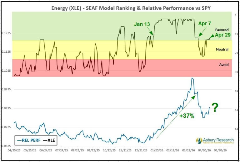
Chart 1
Utilities (XLU)
Defensive Utilities (XLU) is the SEAF Model’s seventh-ranked sector this week with a Ranking Score of 20. Chart 2 below shows that Utilities previously resided in Favored status between Feb 12th and Apr 13th (upper panel) while XLU outperformed the benchmark S&P 500 (SPY, lower panel) by 4% (lower panel). It also shows that Utilities has since declined into Neutral status as of Apr 14th while XLU has underperformed SPY by 6%. It would take a sustained move back into Favored status to indicate Utilities is once again a long/overweight opportunity. Utilities is currently the sixth-best-ranked sector year-to-date, according to ssga.com, rising 9.0% year-to-date while outperforming the State Street® SPDR® Portfolio S&P 500® ETF (SPYM) by 3.3%. On a trailing 12-month basis, XLU is the seventh-best-performing Sector SPDR ETF, rising by 17.6% while underperforming the State Street® SPDR® Portfolio S&P 500® ETF (SPYM) by 11.2%.
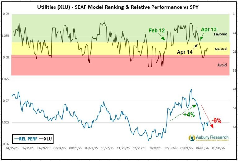
Chart 2
Health Care (XLV)
Defensive Health Care (XLV) is the SEAF Model’s worst-ranked sector this week with a Ranking score of 31, placing it deep in Avoid status. The red highlights in the upper panel show that Health Care initially moved out of Favored status on Feb 11th and, with the exception of a couple of days in late February, has remained in Neutral or Avoid status since then, while XLV has underperformed the benchmark S&P 500 (SPY, lower panel) by 13.0%. Health Care is currently the worst-performing sector year-to-date, according to ssga.com, declining by 6.2% while underperforming the State Street® SPDR® Portfolio S&P 500® ETF (SPYM) by 12.0%. On a trailing 12-month basis, XLV is the second-worst-performing sector, rising by 6.2% while underperforming the State Street® SPDR® Portfolio S&P 500® ETF (SPYM) by 22.9%.
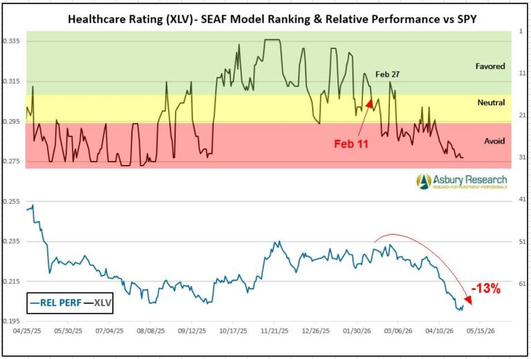
Chart 3